

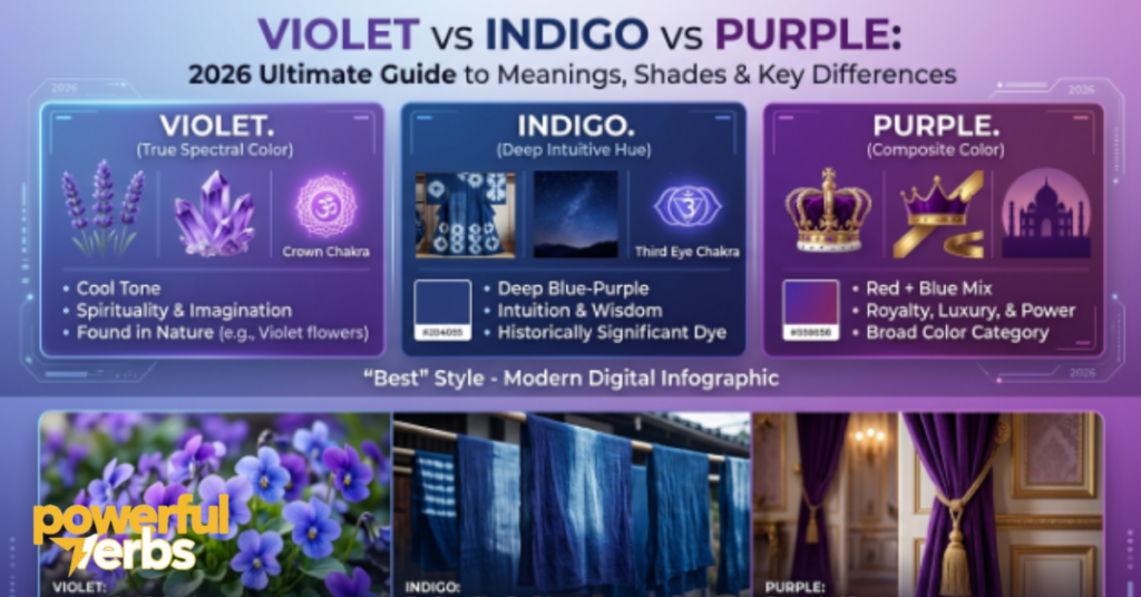
Color is one of the most immediate and personal experiences a human being has. Before you process language, before you recognize shapes, before you form a conscious thought about what you are looking at, your brain has already registered color. It is that fundamental to how you experience the world around you.
Yet color is also one of the most genuinely misunderstood phenomena in everyday life. People who have spent decades looking at the visible spectrum — painting, designing, decorating, observing nature — still find themselves uncertain about the difference between colors that look similar but are not the same. And nowhere in the color world does this uncertainty appear more persistently than in the space occupied by violet, indigo, and purple.
These three colors sit in the same general region of the visible spectrum and the color wheel. They share a family resemblance that is real and not simply a matter of poor observation. They have been confused with each other by artists, scientists, educators, and everyday observers for centuries. They are used interchangeably in casual conversation so frequently that many people genuinely believe they are the same thing described by three different names.
They are not. Each one has a distinct scientific identity, a separate place in the history of human culture, a unique set of psychological associations, and a different set of practical applications in art, design, and communication. Understanding those distinctions does not require a physics degree or a background in art history. It requires a clear, systematic explanation of what makes each color uniquely itself — which is exactly what this guide provides.
The Core Question — Are Violet, Indigo, and Purple the Same Color?
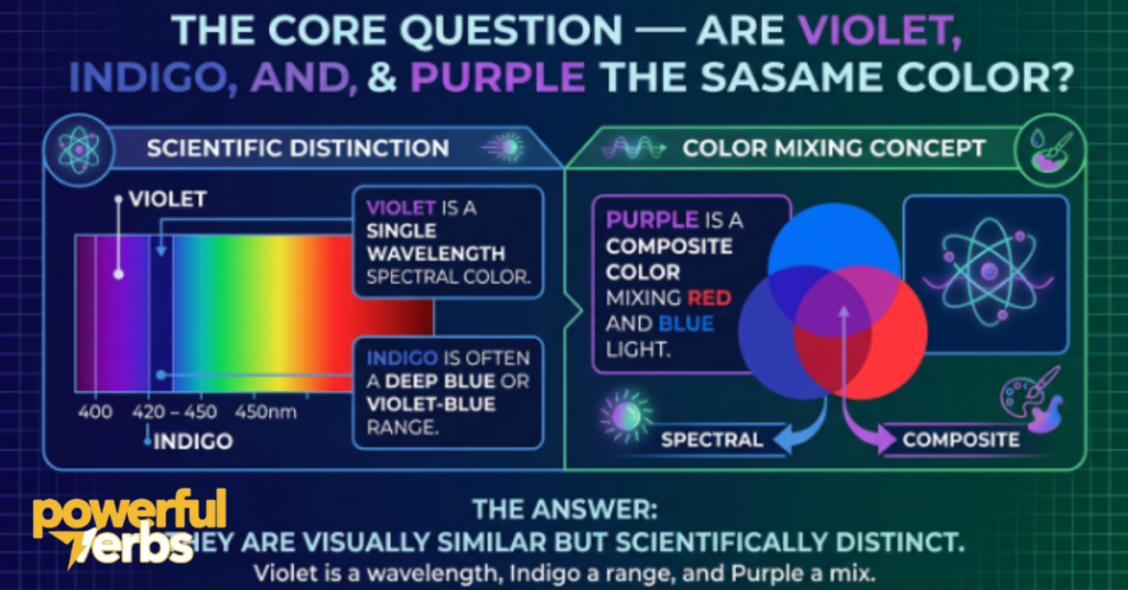
The direct answer is no — violet, indigo, and purple are three distinct colors, and the distinctions between them operate at multiple levels simultaneously.
At the scientific level, the differences are absolute and measurable. Violet is a real spectral color, meaning it corresponds to a specific range of wavelengths of electromagnetic radiation that the human eye can detect. It exists independently in nature as part of the visible light spectrum. Indigo also occupies a position on the visible spectrum, though its status as a genuinely distinct spectral band has been debated by physicists and color scientists for decades. Purple, by contrast, is not a spectral color at all. It has no corresponding wavelength. It does not exist in a rainbow or a prism’s output. It is a perceptual color — a color that the human visual system produces when two non-adjacent parts of the spectrum stimulate the eye simultaneously.
At the perceptual level, the differences are real but more subtle, which is why casual observers frequently miss them. Violet leans strongly toward blue and appears cool, crisp, and clear. Indigo sits deeper and darker, resembling a navy or midnight blue with a barely perceptible violet undertone. Purple is warmer and more complex, carrying a reddish quality that neither violet nor indigo possesses, and varying widely depending on how much red relative to blue is present in its composition.
At the cultural and symbolic level, the differences are profound and historically significant. Each color carries its own set of associations, meanings, and traditions that developed independently across different civilizations and time periods. Conflating them erases centuries of distinct human relationship with each individual color.
Violet — The True Spectral Color Explained
Violet is the color that sits at the far end of the visible light spectrum — the boundary where human vision reaches its limit and the electromagnetic radiation beyond becomes ultraviolet, invisible to the naked eye. It is a genuine spectral color in the fullest scientific sense, meaning it corresponds to a specific range of wavelengths that exist independently in nature and do not require any mixing or blending to produce.
The wavelength range associated with violet spans approximately 380 to 450 nanometers. At the lower end of that range, violet approaches the absolute edge of human visual perception. At the upper end, it begins to shade into blue, which is why violet is so frequently confused with blue-leaning colors and why the boundary between violet and indigo is a matter of genuine scientific debate rather than simple visual identification.
What makes violet perceptually distinctive is its quality of coolness and clarity. When you look at a true violet, you are seeing a color that stimulates the blue-sensitive cones in your eye more strongly than anything else, with a degree of red cone stimulation that is subtle but present. This combination produces a hue that feels simultaneously deep and luminous — darker than a bright blue but without the warmth that red introduces into purple.
In nature, violet appears with remarkable consistency in certain botanical contexts. The flower that gives the color its name — the viola, from which the English word violet derives — displays a hue that genuine color scientists would classify as violet rather than purple, though popular usage frequently applies both terms without distinction. Lavender, despite being named for the lavender plant, occupies a lighter, desaturated version of the violet space. The aurora borealis occasionally produces violet fringes at its outer edges under specific atmospheric conditions. Certain crystals and minerals, particularly amethyst at its clearest and most blue-tinted, approach the violet range.
The word violet entered English through French and ultimately derives from the Latin viola, which referred to the flower. This etymological path — from botanical observation to color name — is different from the paths that gave indigo and purple their names, reflecting the different cultural contexts in which each color was first identified and categorized.
Indigo — The Most Debated Color in the Visible Spectrum
Indigo occupies a unique position in the history of color — it is the only color in the standard rainbow whose right to be there has been seriously questioned by modern science. Understanding why requires a brief excursion into history and into the way scientific categorization of color has evolved over the centuries.
When Isaac Newton conducted his famous prism experiments in the seventeenth century and produced a spectrum of light by passing a beam through a glass prism, he identified and named seven distinct colors: red, orange, yellow, green, blue, indigo, and violet. The choice of seven was not purely scientific. Newton was deeply interested in the relationship between color and music, and he wanted the number of colors in the spectrum to correspond to the number of notes in a musical scale. Seven notes, seven colors. The symmetry was meaningful to him philosophically even if it was not strictly demanded by the physics.
Modern color science does not recognize indigo as a distinct spectral band in the same way it recognizes the other six colors Newton named. The wavelength range typically assigned to indigo — approximately 445 to 464 nanometers — represents a transition zone between blue and violet rather than a perceptually distinct color category that most human observers can reliably separate from its neighbors. In controlled studies, many people cannot consistently distinguish indigo from a deep blue or a blue-violet when viewing isolated color samples.
Despite this scientific uncertainty, indigo has an extraordinarily rich and historically significant identity that is entirely independent of its spectral status. The word indigo does not come from a physical description of light. It comes from a plant — Indigofera tinctoria — and from the trade routes along which the dye extracted from that plant traveled from its origins in South Asia to markets across the ancient and medieval world. The color indigo is, at its cultural core, the color of that dye — a deep, saturated blue-violet that sat at the center of global textile trade for thousands of years.
Visually, indigo presents itself as a dark, dense color that reads primarily as blue under most lighting conditions but reveals a violet undertone when placed alongside true blues. It resembles the color of deep denim, of a night sky just after sunset when the last light has faded but full darkness has not yet arrived, of certain varieties of blueberries at their deepest point of ripeness.
Purple — The Color Your Brain Invents
Purple is the most philosophically interesting of the three colors in this guide, and the reason is scientific rather than mystical. Purple does not exist as a wavelength of light. It has no position on the electromagnetic spectrum. If you were to look at a rainbow — which displays every spectral color that the human eye can detect — you would find violet at one end and red at the other, but you would not find purple anywhere between them. Purple is absent from the rainbow not because it is rare but because it is physically impossible for a rainbow to produce it.
The reason for this absence is fundamental to understanding what purple actually is. The human eye contains three types of color-sensitive cells called cones, each of which responds most strongly to a different part of the visible spectrum. One type responds most strongly to short wavelengths in the blue-violet range. Another responds most strongly to medium wavelengths in the green range. The third responds most strongly to long wavelengths in the red-orange range. When light of a specific wavelength enters the eye, it stimulates these three cone types in specific proportions, and the brain interprets the resulting combination of signals as a particular color.
Purple occurs when the red-sensitive cones and the blue-sensitive cones are stimulated simultaneously without significant stimulation of the green-sensitive cones in between. This can happen when you look at a surface that reflects both red and blue light, or when red and blue light sources illuminate the same point. The brain receives signals from two ends of the spectrum without the middle, and it resolves this unusual input by generating a color perception that does not correspond to any single wavelength — a color that exists entirely in the neural processing of visual information rather than in the physics of light itself.
This is why purple is sometimes called an extra-spectral color or a non-spectral color in technical literature. It is real as a perceptual experience — millions of people see it every day and recognize it immediately — but it has no physical existence as a distinct electromagnetic frequency. It is, in the most literal sense, a creation of the human brain.
Violet vs Indigo vs Purple — Side by Side Scientific Comparison
Placing these three colors directly alongside each other in scientific terms reveals differences that aesthetic comparison alone cannot capture.
Violet is a spectral color with a wavelength range of approximately 380 to 450 nanometers. It is produced by a single band of electromagnetic radiation and exists independently in natural light phenomena including rainbows, prism outputs, and certain atmospheric optical effects. Its perception involves strong stimulation of the short-wavelength cones and minimal stimulation of the long-wavelength cones, producing a color that reads as predominantly blue with a subtle but distinct quality that separates it from pure blue.
Indigo occupies a debated but historically acknowledged position in the spectrum at approximately 445 to 464 nanometers. Its perceptual distinctiveness from blue and violet is limited for most human observers, which is why modern colorimetry does not always treat it as a separate category. Its strongest identification is cultural and historical rather than strictly perceptual — it is the color of a specific dye rather than of a specific wavelength range that the human visual system consistently treats as categorically distinct from its neighbors.
Purple has no wavelength because it is not a spectral color. It is produced perceptually when red and blue light stimulate the eye simultaneously, and its appearance varies enormously depending on the ratio of red to blue in its composition. A purple with more red reads as warm, almost magenta-adjacent. A purple with more blue reads as cool, approaching violet. The enormous variability of purple’s appearance is a direct consequence of its non-spectral nature — because it is defined by a mixture rather than by a specific wavelength, the range of colors that legitimately qualify as purple is far wider than the range that qualifies as violet or indigo.
How the Human Eye Perceives Each Color Differently
The human visual system does not process violet, indigo, and purple in identical ways, and understanding these perceptual differences explains why the colors feel so distinct even when they appear superficially similar.
Violet stimulates the short-wavelength cones — sometimes called the S-cones or blue cones — more intensely than any other color in the visible spectrum. Because violet sits at the extreme short-wavelength end of human vision, it also triggers a minor response from the long-wavelength cones in a phenomenon called the Bezold–Brücke hue shift, which contributes to violet’s distinctive quality of feeling simultaneously blue and slightly reddish without actually being either. This dual stimulation at the edges of the visual system gives violet its characteristic depth and mystery.
Indigo, occupying a slightly longer wavelength than violet, stimulates the S-cones somewhat less intensely and produces a perceptual experience that most observers process as a very dark, saturated blue. The violet undertone that distinguishes indigo from pure blue is subtle enough that many observers identify indigo as blue rather than as a separate category without careful comparison under controlled conditions.
Purple stimulates both the S-cones and the L-cones — the long-wavelength or red-sensitive cones — simultaneously, without significant M-cone (green-sensitive) stimulation. The brain’s resolution of this unusual signal produces a color experience that has no spectral equivalent, which is why purple can look warm or cool, bright or muted, close to red or close to blue, depending on the specific mix of wavelengths producing it.
The Wavelength Breakdown — Where Each Color Sits on the Spectrum
Wavelength measurement provides the most objective available basis for distinguishing spectral colors, and the numbers associated with violet and indigo reveal exactly where they sit in the hierarchy of visible light.
The visible spectrum spans approximately 380 to 700 nanometers in total. Red occupies the long-wavelength end at roughly 620 to 700 nanometers. As wavelengths shorten, colors progress through orange, yellow, green, and blue before reaching the short-wavelength colors that concern this guide.
Violet begins where blue ends, at approximately 450 nanometers, and extends down to the edge of human visual perception at around 380 nanometers. The lower boundary is not sharp — different individuals have slightly different thresholds for the shortest wavelengths of visible light, which is why some people see more violet in a spectrum than others do. Below 380 nanometers, radiation becomes ultraviolet, which the human eye cannot detect under normal conditions.
Indigo, in the frameworks that treat it as a distinct spectral band, occupies approximately 445 to 464 nanometers — a narrow range that sits at the upper boundary of what some scientists classify as violet and the lower boundary of what others classify as blue. The narrowness of this range contributes significantly to the debate about whether indigo deserves recognition as a separate color category or whether it is simply a region of transition between blue and violet.
Purple, having no wavelength of its own, is defined in colorimetric systems by its position outside the spectral locus — the curved boundary on a color diagram that represents all the spectral colors. Purple colors occupy the straight line connecting the red end to the violet end of that curve, a region sometimes called the line of purples, which contains colors that cannot be produced by any single wavelength of light.
Color Temperature — Cool, Warm, and Neutral Qualities of Each Shade
Color temperature is not a measurement of physical heat but a perceptual quality that describes whether a color feels visually cool, like blue or green, or visually warm, like red or orange. For violet, indigo, and purple, temperature is a crucial distinguishing characteristic.
Violet is one of the coolest colors in the visible spectrum. Its blue dominance gives it an inherent coolness that persists across most lighting conditions and applications. In interior design, a true violet reads as cool and calming. In painting, it recedes from the viewer in the same way that blue recedes, creating a sense of depth and distance. In fashion, violet carries the elegant, composed quality that cool colors typically convey.
Indigo is similarly cool but adds a quality of depth and weight that pure violet does not possess. Its darkness contributes to a sense of heaviness and solidity that makes indigo feel grounded and authoritative rather than airy. This is part of why indigo became the dominant color of workwear — the indigo-dyed denim of jeans conveys reliability and practicality rather than delicacy or elegance.
Purple occupies a unique position in the temperature spectrum because it contains red, which introduces warmth into a color family otherwise dominated by cool blue. The temperature of any specific purple depends entirely on its composition. A purple produced from equal amounts of a warm red and a cool blue will feel approximately neutral. A purple with more red will feel warm, approaching the territory of magenta or fuchsia. A purple with more blue will feel cool, approaching violet. This temperature variability is one of purple’s defining characteristics and one of the main reasons it is so widely used in design — it can be adjusted to feel at home in both warm and cool color palettes.
Violet, Indigo, and Purple in the Natural World
Nature produces these three colors through different chemical and physical mechanisms, and understanding those mechanisms deepens appreciation for how they appear in the world around us.
Violet in nature is produced primarily by anthocyanin pigments — a family of water-soluble compounds found in the cells of many flowering plants. Anthocyanins are remarkable because their color changes depending on the pH of the cellular environment in which they exist. In acidic conditions, anthocyanins produce red and pink tones. As pH increases toward neutral and then alkaline, they shift through purple and into blue-violet and true violet. This pH sensitivity means that a single plant can produce flowers in different color ranges depending on the soil chemistry in which it grows.
The flowers most associated with violet in the natural world include violas and violets themselves, certain varieties of lavender at their most blue-tinted, some species of iris, and various alpine flowers that evolved bright colors to attract pollinators in high-altitude environments where color contrast is particularly valuable. The aurora borealis occasionally displays violet fringes at the outer edges of its formations when solar radiation excites nitrogen and oxygen atoms in the upper atmosphere at specific altitudes.
Indigo in nature was historically sourced almost exclusively from plants in the genus Indigofera, particularly Indigofera tinctoria, which was cultivated across South Asia, West Africa, and parts of Central and South America for thousands of years. The dye molecule indican is present in the leaves of these plants and is converted to indigotin — the actual blue pigment — through a fermentation process. Other plant sources of similar blue-violet dyes include woad, which was used in Europe before trade routes brought Asian indigo, and certain species of Japanese knotweed used in traditional Japanese dyeing.
Purple in nature is genuinely rare, which is part of what made Tyrian purple so extraordinarily valuable in antiquity. Most natural pigments that appear purple do so through the same anthocyanin chemistry that produces violet, but with a pH balance that shifts the pigment toward the red-blue mixture that the brain reads as purple. Grapes, plums, eggplants, certain species of iris, and some varieties of dahlia and orchid display natural purple tones. In the animal kingdom, certain species of tropical fish, some butterfly wings, and specific bird feathers display structural coloration that produces purple through the physical interaction of light with microscopic surface structures rather than through chemical pigmentation.
These natural color variations are part of why flowers have long served as one of language’s richest sources of figurative expression. Writers and poets have used flowers not just to describe color, but to capture emotion, fragility, and beauty in ways that plain description cannot. For a closer look at how these comparisons work in everyday English, this collection of 85 metaphors for flowers breaks down exactly how flower imagery is used to express meaning beyond color alone.
Historical Origins of Each Color
Each of these three colors has a distinct historical origin story that shaped how it was understood, used, and valued across human civilizations.
Violet’s history as a color name and concept is ancient, rooted in the botanical observation of flowers that ancient Greeks and Romans identified and named. The Latin viola gave its name both to the flower and to the color, and the association between the color and its floral namesake remained so strong that violet was understood primarily as a natural color — the color of certain flowers, of twilight skies, of certain gemstones — rather than as a manufactured or commercially produced color. This natural association gave violet a different cultural character from purple, which was always understood in the ancient world as an artificially produced and extraordinarily expensive color.
Indigo’s history is inseparable from the history of textile production, trade, and the global economy of natural dyes. Archaeological evidence suggests that indigo dyeing was practiced in Peru as early as 6,000 years ago, making it one of the oldest known dyes in human history. In India, indigo cultivation and processing developed into a sophisticated industry that eventually supplied much of the ancient and medieval world. The word indigo itself derives from the Greek indikon, meaning Indian — a direct acknowledgment of the geographic origin of the dye that defined the color’s cultural identity. When European traders first encountered the deep blue-violet dye coming from India, they named it after its source, and that name has persisted for more than two thousand years.
Purple’s historical origin as a manufactured color is one of the most dramatic stories in the entire history of materials and trade. Tyrian purple — named for the Phoenician city of Tyre, which was its primary production center — was extracted from the hypobranchial gland of sea snails, primarily Murex brandaris and related species. The extraction process was extraordinarily labor-intensive and produced a foul odor that ancient sources describe as repellent. Producing a single gram of dye required thousands of snails, which meant that Tyrian purple fabric was priced by weight comparably to gold. This extraordinary cost made purple fabric a symbol of supreme wealth and power across the ancient Mediterranean world, and the association between purple and royalty that persists in contemporary culture traces directly to this economic reality.
Cultural Symbolism Across Civilizations
The symbolic meanings that different cultures have attached to violet, indigo, and purple reflect both the physical properties of each color and the historical circumstances under which each one became significant to particular societies.
Violet carried spiritual significance in European Christian tradition, where it was associated with penitence, humility, and the contemplative life. Advent and Lent, the two major penitential seasons of the liturgical calendar, are traditionally represented by violet vestments and decorations. This association connected violet to the interior life of spiritual preparation and discipline. In Eastern spiritual traditions, violet is connected to the crown chakra — the energy center at the top of the head — which is associated with the highest states of consciousness, divine connection, and transcendence. This parallel across different religious traditions gave violet a remarkably consistent spiritual identity across cultures that had no historical contact with each other.
Indigo carried different symbolic weights in different cultures, shaped by its identity as a trade good and a craftsperson’s material rather than a royal or spiritual color. In Japan, the tradition of indigo dyeing — known as aizome — produced a deep, saturated blue-violet that became associated with craft excellence, endurance, and the aesthetic values of the working and artisan classes. Japanese artisans developed hundreds of named shades within the indigo spectrum, reflecting a degree of nuanced attention to color that expressed deep cultural values about material quality and attention to detail. In West African cultures, indigo dyeing traditions developed independently and became associated with specific social roles, ritual occasions, and regional identities.
Purple’s symbolic associations in the ancient Mediterranean world were defined entirely by its economic value. Because only the wealthiest individuals and institutions could afford Tyrian purple fabric, the color became an immediate visual signal of supreme status. Roman emperors reserved certain shades of purple for exclusive imperial use, and wearing unauthorized purple was a serious offense. Byzantine emperors were described as born to the purple — a phrase that survives today as an idiom for hereditary privilege. When synthetic dyes made purple accessible to everyone in the nineteenth century, the color’s economic exclusivity disappeared, but the psychological association between purple and prestige, luxury, and elevated status has proven extraordinarily durable.
Emotional and Psychological Effects of Each Color
Color psychology — the study of how colors affect human emotion, behavior, and perception — has produced consistent findings about the emotional qualities associated with violet, indigo, and purple, even when the mechanisms behind those associations are complex and culturally inflected.
Violet produces psychological responses associated with creativity, imagination, and spiritual sensitivity. People exposed to violet in controlled environments tend to report feelings of inspiration, introspection, and expansiveness. Violet is the color most frequently associated with artistic and creative identity in Western culture — it signals unconventional thinking, aesthetic sensitivity, and a willingness to engage with ideas that exist outside mainstream categories. Interior designers use violet sparingly because its psychological intensity can become overwhelming in large quantities, but in small doses it elevates the perceived creativity and sophistication of a space.
Indigo produces effects associated with depth, seriousness, and intellectual engagement. Its darkness gives it a quality of weight and authority that lighter colors lack. Indigo environments tend to feel contemplative and focused — appropriate for spaces dedicated to serious thought, study, or reflective practice. The color is associated in color psychology with integrity, deep knowledge, and a kind of wisdom that comes from sustained engagement with complex subjects rather than from quick surface-level processing.
Purple’s psychological effects are more variable than those of violet or indigo, which reflects its compositional variability. In general, purple stimulates a sense of luxury, fantasy, and creative possibility. It occupies a psychological middle ground between the warmth of red and the coolness of blue, giving it an ambivalent quality that many people find simultaneously exciting and unsettling. Brands use purple to signal premium quality, mystical or fantastical associations, or creative distinction from competitors in fields dominated by safer color choices.
Violet, Indigo, and Purple in Art and Painting
Artists working with violet, indigo, and purple navigate a complex set of practical and perceptual challenges that make these colors among the most demanding to handle with skill and intention.
Violet presented significant technical challenges for painters working before the development of synthetic pigments in the nineteenth century. The natural pigments capable of producing true violet — including certain mineral compounds and some plant-based dyes — were difficult to obtain, unstable over time, or expensive. Many paintings that appear brown or gray in medieval and Renaissance works were originally painted in violet pigments that faded or chemically transformed over the centuries. The development of synthetic violets, including the mauve accidentally discovered by William Perkin in 1856, revolutionized the availability of violet for artistic use.
In color theory, violet and purple occupy a position between warm and cool that gives them particular importance in creating visual harmony and tension. The Impressionists discovered that violet shadows — rather than the gray or brown shadows that academic painting had traditionally used — more accurately represented the visual experience of outdoor light, and their systematic use of violet in shadowed areas transformed the expressive possibilities of landscape painting. Vincent van Gogh used violet and purple with particular intensity, understanding that these colors in proximity to yellows and oranges would create the maximum possible simultaneous contrast and visual vibration.
Indigo as a pigment has a long history in painting traditions across Asia, where it was used both as a standalone color and as a component of blended blue-greens. Its relatively low lightfastness — its tendency to fade when exposed to sustained light — meant that it was gradually replaced in many painting traditions by more stable synthetic blues, but its distinctive quality of depth and warmth remains valued by artists who work with traditional or natural pigment systems.
How to Mix Each Color Accurately With Pigments
Mixing violet, indigo, and purple from basic pigments requires understanding both the theoretical basis of color mixing and the practical behavior of specific pigment types.
Mixing violet presents the greatest technical challenge of the three. True spectral violet cannot be perfectly replicated by mixing pigments because the perception of spectral violet involves a specific pattern of cone stimulation that mixed pigments cannot exactly reproduce. The closest approximation uses a cool, blue-leaning blue — ultramarine or cobalt rather than cerulean or phthalo — combined with a very small amount of a cool red such as quinacridone magenta. The ratio must be heavily weighted toward blue, as even small additions of red quickly push the mixture toward purple rather than violet. Artists seeking to preserve the cool quality of violet should avoid warm reds and warm blues entirely when mixing, as these introduce undertones that muddy the result.
Mixing indigo requires a different approach because indigo is not simply a darker violet. The depth and weight of indigo comes from a combination of blue saturation and relative darkness that is difficult to achieve through simple additive mixing. The most effective approach combines a deep ultramarine blue with a small amount of violet and an even smaller amount of black or burnt umber to deepen the value without shifting the hue toward gray. Some artists find that a ready-made indigo pigment — available from several manufacturers — provides a more reliable starting point than attempting to build the color from scratch through mixing.
Mixing purple is the most straightforward of the three because purple is compositionally the most flexible. A balanced mixture of a warm red and a cool blue produces a middle purple that can then be adjusted in either direction — more red for warmth, more blue for coolness. The key technical consideration is avoiding the muddiness that occurs when mixing complementary colors is introduced inadvertently. Using transparent pigments rather than opaque ones for purple mixing typically produces a cleaner, more luminous result.
Violet, Indigo, and Purple in Digital Design and RGB Systems
Digital color systems operate on fundamentally different principles from pigment mixing, and understanding how violet, indigo, and purple are represented in RGB and other digital color models helps designers work with them accurately and consistently.
In the RGB color model used by digital screens, colors are produced by combining red, green, and blue light at varying intensities on a scale from 0 to 255. Violet in RGB is represented with high blue values and moderate red values with minimal green — a typical violet might be expressed as approximately R: 127, G: 0, B: 255, though many variations exist within the violet range. The absence or near-absence of green is the defining characteristic of violet in digital color space.
Indigo in RGB typically appears as a dark, blue-dominant color with a modest violet component — something like R: 75, G: 0, B: 130 is often cited as a standard indigo value, though as with its spectral status, the exact digital definition varies depending on the source. The relatively low red value compared to what a purple would require is what preserves indigo’s essentially blue character in digital contexts.
Purple in RGB requires roughly comparable values of red and blue with minimal green. A middle purple might be expressed as approximately R: 128, G: 0, B: 128 — the equal balance of red and blue that produces a neutral purple without warm or cool bias. Adjusting the red value upward produces warmer, more magenta-adjacent purples. Adjusting the blue value upward produces cooler purples that approach violet. The flexibility of purple in digital space mirrors its flexibility in pigment mixing, making it one of the most adjustable colors available to digital designers.
These Colors in Fashion, Interior Design, and Branding
The practical applications of violet, indigo, and purple in professional design contexts reflect both their visual properties and their cultural associations.
Violet in fashion signals creativity, artistic identity, and a willingness to stand apart from conventional color choices. It appears most frequently in garments associated with expressive personal style rather than conservative professional contexts. In interior design, violet works best as an accent color used in small quantities to introduce visual interest and a sense of creative energy into spaces that might otherwise feel conventional. As a branding color, violet is used by companies seeking to associate themselves with innovation, imagination, and a certain elevated aesthetic sensibility.
Indigo in fashion is ubiquitous in a way that is easy to overlook because its most common application — denim — has become so normalized that most people do not consciously identify it as indigo. The specific shade of well-worn blue jeans is an indigo-derived color that has become one of the most widely recognized and universally accepted colors in global fashion. In interior design, indigo works as a sophisticated alternative to navy blue that carries more visual complexity and warmth. In branding, indigo conveys authority, trustworthiness, and the kind of depth and seriousness associated with established expertise.
Purple in fashion has historically signaled luxury and status, and while the economic barrier that once made purple fabric exclusive no longer exists, the psychological association persists. Purple garments in contemporary fashion continue to carry a sense of specialness and elevated quality that makes them feel different from safer, more conventional color choices. In interior design, purple is used to create dramatic, opulent spaces that feel rich and layered. In branding, purple is employed across a wide range of sectors — from luxury goods to creative services to confectionery — wherever the goal is to communicate premium quality or imaginative distinction.
Rare and Famous Shades Within Each Color Family
Within each of the three broad color categories, specific named shades have achieved cultural significance or historical importance that makes them worth knowing separately from the general category.
Within violet, notable specific shades include mauve — the first synthetic dye color, discovered accidentally by William Perkin in 1856 while attempting to synthesize quinine, which launched the synthetic dye industry and made affordable violet-range colors available for the first time in history. Wisteria is a soft, grey-tinged violet named for the flowering plant whose cascading blossoms display one of the most recognizable natural violets. Heliotrope is a pink-violet named for the heliotrope flower and associated with the fashionable excesses of late Victorian and Edwardian color sensibility.
Within indigo, the range of named shades reflects the nuanced attention that cultures with deep indigo dyeing traditions paid to variations within the color. Japanese aizome tradition produced dozens of named shades ranging from the palest blue-grey to the deepest midnight blue-violet. Prussian blue, though categorized as blue rather than indigo, occupies a position close to the indigo range and shares some of its visual character. Persian indigo and natural indigo refer to specific pigment preparations with subtly different visual qualities produced by different source plants and processing methods.
Within purple, Tyrian purple stands as the most historically significant shade — the color that built trade empires and defined royal power across two millennia. Royal purple in contemporary usage refers to a bright, saturated purple that evokes the historical associations of Tyrian purple without necessarily matching its specific hue. Orchid, plum, mulberry, and byzantium are named shades within the purple family that each occupy distinct visual positions and carry different aesthetic associations across fashion, design, and art.
How Lighting Conditions Change What You See
Lighting is perhaps the most consistently underestimated variable in color perception, and for violet, indigo, and purple — colors whose identities can be dramatically affected by spectral shifts in ambient light — understanding how different lighting conditions alter appearance is essential practical knowledge.
Natural daylight at midday, which approximates the full visible spectrum in roughly equal proportions, provides the most neutral baseline for color assessment. Under these conditions, violet appears at its coolest and most blue, indigo reveals its full depth without appearing artificially dark, and purple shows its complete character including whatever warmth its red component contributes.
Natural daylight at sunrise and sunset, which contains a higher proportion of long-wavelength red and orange light, dramatically warms all three colors. Violet under warm golden light shifts noticeably toward purple as the red-orange illumination reinforces the red components of the color’s perception. Indigo under warm light loses some of its violet undertone and reads more straightforwardly as dark blue. Purple under warm light deepens and intensifies, with the red component becoming more prominent.
Incandescent and warm white LED lighting produces effects similar to warm natural light — violet shifts toward purple, and lighter purples can shift toward pink. Cool white LED or fluorescent lighting emphasizes blue and violet components while suppressing red, making purples appear cooler and pushing them visually toward violet.
Professional photographers, color graders, and interior designers who work with violet, indigo, and purple develop the habit of evaluating these colors under multiple light sources before making final decisions, because a color that achieves perfect balance in one lighting condition may shift significantly under the lighting conditions in which it will ultimately be experienced.
Practical Identification Guide — How to Tell Them Apart Instantly
After all of the scientific, historical, and artistic context this guide has provided, a simple practical framework for identifying each color in real-world situations is genuinely useful.
The fastest identification method begins with a single question: does the color have any warm quality? If you detect any redness, any warmth, any quality that feels like it contains heat or energy — even if the color appears predominantly blue — you are almost certainly looking at purple or a warm-leaning shade within the purple family. Violet and indigo are both cool colors that lack red warmth under most viewing conditions.
If the color is cool with no detectable warmth, the next question is about darkness and depth. True violet, while it can vary in saturation and brightness, has a clarity and relative luminosity that distinguishes it from indigo. Indigo reads as distinctly darker and heavier — more like a midnight or navy blue with a barely perceptible violet quality than like a clear, crisp violet. If the cool blue-violet color you are looking at appears dark enough to be mistaken for navy blue under casual observation, it is almost certainly indigo or something in the indigo range.
If the cool color has the clarity and relative brightness of violet without appearing as deep or dark as indigo, and if it registers primarily as blue with a subtle but definite quality that prevents it from being classified as pure blue, then you are looking at violet.
Context provides additional identification support. A pair of jeans is almost certainly indigo. A violet flower is almost certainly displaying true violet. An amethyst gemstone may be violet, purple, or somewhere in between depending on its specific crystal chemistry and the light in which you view it. A bruise changes from red-blue-purple in its early stages toward indigo and deep blue-violet as it ages. A sky at deep twilight moves through purple, violet, and indigo as the sun drops further below the horizon.
see also: Trys or Tries: The Correct Spelling Explained (Simple Guide)
FAQs
Why does purple not appear in a rainbow if it is such a common color?
A rainbow displays only spectral colors — colors that correspond to specific wavelengths of visible light. Purple requires the simultaneous stimulation of both red-sensitive and blue-sensitive cones without the green-sensitive cones between them, which cannot be produced by any single wavelength. Since each position in a rainbow corresponds to a single wavelength, purple has no position in the rainbow and simply does not appear.
Is the indigo in Newton’s rainbow scientifically accurate or historically invented?
Newton added indigo to make the rainbow contain seven colors, partly for philosophical and musical symmetry reasons. Modern color science does not recognize indigo as a perceptually distinct spectral band for most human observers, and many contemporary scientists consider Newton’s inclusion of indigo a historically interesting but scientifically debatable decision.
What is the fastest way to distinguish violet from purple in a real object?
Look for warmth. Purple always contains a degree of red that introduces warmth into the color, even when it appears predominantly blue. Violet is consistently cool with no warmth because it has no red component — it is a short-wavelength spectral color dominated by blue cone stimulation.
Why did Tyrian purple become the color of royalty rather than violet or indigo?
Because Tyrian purple was the color that required thousands of sea snails and extreme labor to produce, making it the most expensive colored fabric available in the ancient world. Violet and indigo dyes, while not cheap, were far more accessible. The scarcity and cost of purple specifically made it the color of supreme power rather than any aesthetic preference for purple over its neighbors.
Can the same flower appear violet to one person and purple to another?
Yes, and this reflects real variability in human color perception rather than simple disagreement. Individual variation in the density and sensitivity of retinal cone cells means that two people looking at the same flower under the same lighting conditions may genuinely experience slightly different color perceptions. Additionally, the anthocyanin pigments that produce violet and purple in flowers are sensitive to pH and can produce slightly different hues in different parts of the same petal.
How does indigo dye produce such a distinctive deep color when applied to fabric?
The indigo molecule bonds to textile fibers through a process called vat dyeing, in which the dye is chemically reduced to a soluble yellow-green form, absorbed by the fiber, and then oxidized back to its insoluble blue form on the surface of the fiber. This oxidation process locks the pigment onto the fiber in a way that creates the deep, saturated blue-violet characteristic of indigo-dyed textiles, with the slightly uneven surface distribution that gives naturally dyed indigo fabrics their distinctive visual depth and variation.
Conclusion
Violet, indigo, and purple are not simply three names for the same general color. They are three distinct entities — scientifically, historically, culturally, and perceptually — that happen to occupy neighboring territories in the visual landscape and share a family resemblance that makes casual confusion understandable but careful distinction genuinely rewarding.
Violet is a real spectral color with a precise wavelength range, a botanical name that connects it to thousands of years of human observation of flowering plants, and a consistent set of cool, spiritual, creative associations that appear remarkably consistently across different cultures and traditions. Indigo is a color defined more by a plant and the global trade routes that plant inspired than by a perceptually distinct spectral band, carrying centuries of craft tradition, economic history, and cultural meaning that makes it far richer than a simple shade of dark blue. Purple is the color that exists nowhere in the physics of light but everywhere in human culture — a creation of the brain, a symbol of power that outlasted the economic conditions that created it, and a design tool of extraordinary flexibility precisely because its non-spectral nature gives it a range that spectral colors cannot match.
Understanding these three colors in their full complexity does not simply satisfy intellectual curiosity. It sharpens artistic judgment, deepens design decisions, enriches historical understanding, and makes the visual world a more interesting and more meaningful place to inhabit.

Liam Johnson is a dedicated language expert with 4 years of professional experience. He specializes in Grammar, Vocabulary, and Sentence structure.
