

Suggested meta description: Confused about beige vs tan? Discover the real difference between these two neutral shades, including undertones, hex codes, and the best way to use each one in fashion, interiors, and design.
Stand in front of a paint wall, scroll through a clothing store, or open a brand style guide, and sooner or later you’ll run into the same quiet argument: is this color beige, or is it tan? The two shades sit so close together on the color spectrum that most people use the names as if they mean exactly the same thing.
They don’t. Beige and tan belong to the same neutral family, but they carry different undertones, different moods, and different jobs to do once they’re applied to a wall, a jacket, or a screen. Mixing them up isn’t a huge mistake, but knowing the difference instantly upgrades how you shop, decorate, and design. This guide breaks the two shades down clearly, shows where each one shines, and gives you a few simple tricks so you never have to guess again.
see also: 1500+ Nouns List in English | With Meaning, Pictures & Free PDF
Why People Confuse Beige and Tan in the First Place
The confusion isn’t really your fault. Beige and tan both fall under the umbrella of “neutral colors,” sitting in that soft zone between white and brown on the color wheel. Neither one is bold enough to grab attention on its own, which is exactly why they get lumped together in casual conversation.
The real distinction comes down to undertone, the subtle hint of another color hiding underneath the main shade. Beige leans on cool or creamy undertones, sometimes with a touch of gray, while tan leans on warm, golden undertones that nod toward yellow and orange. Once you start looking for that underlying warmth or coolness, separating the two becomes almost automatic.
What Exactly Is Beige?
Beige sits right at the pale end of the brown family, close enough to off-white that some people mistake it for a warm version of white rather than a true neutral. In hex terms, classic beige usually lands somewhere around #F5F5DC, a soft blend that reads as gentle and understated rather than rich or saturated. The undertone can shift slightly depending on the batch or brand, sometimes leaning toward a faint gray, sometimes toward a pale cream, but it almost never tips into the golden warmth that defines tan.
The word itself traces back to French, where it originally described the natural, undyed color of raw wool before any dye was added. That origin still shapes how beige feels today: simple, unfinished in a good way, and quietly versatile. Interior designers reach for it constantly because it acts almost like a blank canvas, letting furniture, art, and accent colors take center stage instead of competing with the wall.
Fashion brands lean on it for staple pieces like trench coats, trousers, and knitwear because it pairs effortlessly with almost any other color in a wardrobe. Web and product designers also favor beige backgrounds since the low contrast and soft tone keep a page feeling calm and easy to read without straining the eyes.
What Exactly Is Tan?
Tan moves a step further down the brown spectrum, landing closer to a true light brown with an unmistakable golden or yellow undertone. A typical tan sits around #D2B48C, noticeably warmer and slightly darker than beige even though both colors might look similar in a dim photo. That warmth is what makes tan feel sun-touched, earthy, and grounded rather than soft and airy.
Historically, the name comes from the leather tanning process, where animal hides were treated and cured into that recognizable light brown finish. The connection still shows up everywhere tan is used today, from leather boots and handbags to car interiors and rustic furniture.
Tan also shows up constantly in outdoor and casual fashion, where its warmth complements denim, olive green, and deep browns far better than a cooler shade would. In interior design, tan walls or upholstery create a cozier, more traditional feel compared to the cleaner, more minimal mood that beige tends to produce.
Beige vs Tan: Side-by-Side Comparison
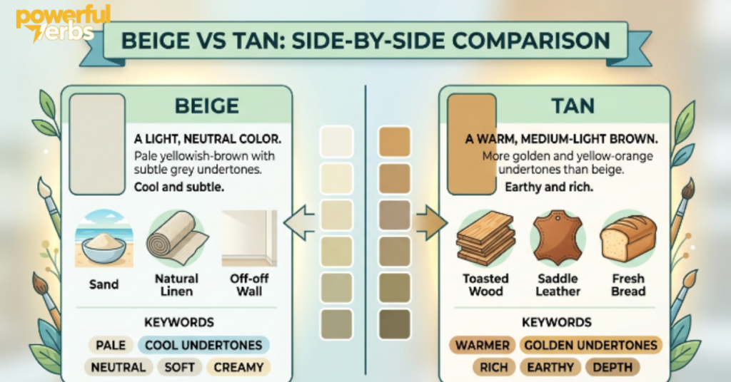
| Aspect | Beige | Tan |
| Typical Hex Code | #F5F5DC | #D2B48C |
| Undertone | Cream, gray, faint cool tones | Golden, yellow, warm tones |
| Brightness Level | Lighter and softer | Noticeably darker and richer |
| Overall Mood | Calm, clean, minimal | Cozy, earthy, grounded |
| Best Paired With | Navy, sage green, charcoal | Olive, rust, chocolate brown |
| Common Applications | Walls, basics, web backgrounds | Leather goods, outdoor wear, rustic decor |
| Design Feel | Modern and understated | Traditional and warm |
How to Tell Them Apart by Eye
If you’re standing in front of two swatches that look almost identical, the fastest trick is to hold them next to a plain white sheet of paper under natural daylight. Beige will barely shift away from the white, staying soft and pale, while tan will visibly warm up and deepen, showing that golden undertone the moment it’s compared to true white.
Indoor lighting can trick the eye, especially under warm yellow bulbs that make every neutral look slightly tan, so professional designers almost always test fabric or paint samples in daylight before making a final call. Another reliable test is squinting slightly at the color; if it still reads as “barely there,” it’s beige, and if it reads as a clear light brown, it’s tan.
see also: 250+ English Sentences for Grade 5 | Daily Use & Examples
Beige vs Tan in Home Interiors
Choosing between the two often comes down to the mood you want a room to carry. Beige walls or sofas tend to recede into the background, making them ideal for minimalist or contemporary spaces where furniture, artwork, or a single bold accent wall need to stand out without visual noise.
Tan, on the other hand, adds warmth and depth on its own, which works beautifully in living rooms, dens, or cabins where a cozy, lived-in feel matters more than a sleek showroom look. Designers frequently pair beige with cooler accents like navy, slate gray, or sage green to keep a space feeling fresh, while tan pairs naturally with deeper earth tones like rust, olive, or chocolate brown for a layered, rustic palette.
Beige vs Tan in Fashion and Wardrobe Styling
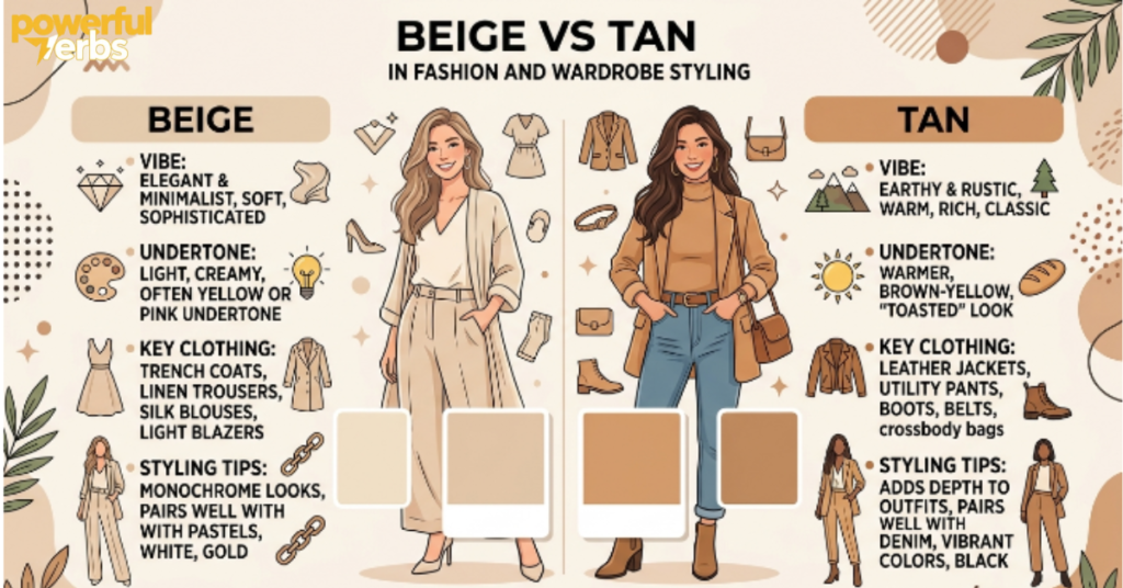
In clothing, beige reads as the quieter, more polished option, which is exactly why it shows up so often in tailored coats, dress trousers, and minimalist capsule wardrobes built around clean lines. It photographs well, transitions easily between seasons, and rarely clashes with anything else in a closet.
Tan carries more personality, often showing up in leather jackets, boots, suede accessories, and outdoor or workwear-inspired pieces where a warmer, more rugged look is the goal. A simple styling rule many stylists follow is to treat beige as a base layer that disappears into the background and tan as a statement neutral that adds visible warmth and texture to an outfit.
Beige vs Tan in Web, Branding, and Graphic Design
Neutral backgrounds matter just as much on screens as they do on walls. Beige backgrounds are common in editorial websites, wellness brands, and minimalist product pages because the low-contrast, soft tone keeps long blocks of text comfortable to read.
Tan, with its slightly stronger warmth, shows up more often in branding tied to nature, leather goods, coffee, or outdoor lifestyle products, where a touch of earthy richness reinforces the brand’s identity. Designers also need to watch contrast ratios carefully with both shades, since light neutrals can fail accessibility standards if text color isn’t dark enough against them.
Where Khaki, Taupe, Sand, and Camel Fit In
Beige and tan don’t exist alone; they sit inside a wider family of muted neutrals that often get confused with each other too. Khaki carries a slightly green-gray undertone and originated from military uniform dye, giving it a more utilitarian feel than either beige or tan. Taupe blends brown and gray in fairly equal measure, making it cooler and more sophisticated than tan but slightly darker than typical beige.
Sand color sits almost exactly between beige and tan, often used interchangeably with both depending on the brand. Camel, named after the animal’s coat, leans warmer and richer than tan, closer to a true light brown with a noticeable orange undertone. Understanding these close cousins makes it much easier to pinpoint exactly where beige and tan sit on the larger neutral color spectrum.
Common Mistakes People Make
The most frequent mistake is judging a color from a screen or a photo instead of an actual physical sample, since screen calibration and lighting filters can shift a true tan into looking beige or wash a true beige out into looking almost white.
Another common slip-up is mixing furniture or clothing pieces that were chosen under different undertone assumptions, ending up with a beige sofa that clashes against a tan rug because one leans cool and the other leans warm. Buying paint without testing a swatch on the actual wall, under the room’s real lighting, is another classic error that leads to a color looking nothing like it did on the small chip in the store.
Quick Way to Remember the Difference

If nothing else sticks, hold onto this: beige is the shade that barely announces itself, staying close to white with just a whisper of warmth, while tan is the shade that’s clearly been “touched by the sun,” carrying a visible golden glow that beige never quite reaches.
Final Thoughts
Beige and tan will probably keep getting used interchangeably in everyday conversation, and most of the time that’s harmless. But once you understand that beige leans cool, light, and minimal while tan leans warm, deeper, and earthy, choosing between them for a wall, an outfit, or a design project becomes far easier. Test a real swatch in daylight whenever possible, pay attention to the undertone rather than just the overall lightness, and the right neutral will reveal itself almost instantly.
see also: 1500+ Nouns List in English | With Meaning, Pictures & Free PDF
FAQs
Is beige lighter than tan?
Yes. Beige consistently reads as the lighter, paler shade, while tan is darker and carries more visible warmth and depth.
Can beige and tan be used together in the same room or outfit?
Absolutely. Since both are neutrals, they blend well together, though pairing them with a complementary accent color helps avoid a flat or overly washed-out look.
Which color is more popular for home interiors, beige or tan?
Beige tends to dominate modern and minimalist interiors, while tan remains the go-to choice for warmer, more traditional or rustic spaces.
Does tan always have a golden undertone?
Most true tans carry a noticeable yellow or golden undertone, which is the main feature separating them from cooler neutrals like beige or taupe.
Is khaki the same as tan?
No. Khaki has a green-gray undertone rooted in its military origin, making it cooler and more muted than the warmer, golden tone of tan.
How can I quickly tell beige and tan apart while shopping?
Hold the item next to a plain white object in natural light; beige will barely shift in tone, while tan will visibly warm up and deepen.

Liam Johnson is a dedicated language expert with 4 years of professional experience. He specializes in Grammar, Vocabulary, and Sentence structure.
