

Color is one of the most intimate experiences a human being can have, yet even the most visually aware people stumble when it comes to violet, indigo, and purple. These three shades sit so close to each other on the visual spectrum that distinguishing them feels almost impossible at first glance. Ask ten people to point to indigo in a painting, and you will likely get ten different answers. The confusion is not a sign of poor vision. It is a sign that these colors operate on multiple levels simultaneously — scientific, psychological, cultural, and artistic — and each level tells a slightly different story.
The short answer to whether violet, indigo, and purple are the same color is no. But the longer answer is far more interesting, and understanding it changes the way you see color forever.
see also: Phoenix vs Pheonix: Meaning, Spelling, and Key Differences (2026)
What Science Actually Says About These Three Colors
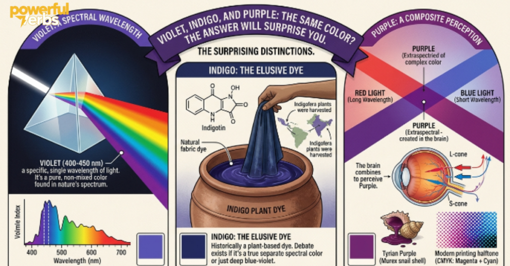
Before diving into symbolism and art, it helps to understand what physics and biology say about these colors. The human eye detects color through cone cells that respond to different wavelengths of light. The visible spectrum runs from roughly 380 nanometers at the violet end to about 700 nanometers at the red end. Where a color falls on that spectrum determines whether it is a true spectral color or a perceptual one — and this distinction is the key to everything.
Violet sits at the shortest visible wavelengths, approximately 380 to 450 nanometers. It is a genuine spectral color, meaning it exists as a distinct frequency of light. When sunlight passes through a glass prism or through water droplets in the atmosphere, violet appears naturally at the edge of the rainbow. It does not need to be created by mixing other colors. The eye perceives it directly because light of that specific wavelength reaches the retina and triggers the appropriate cone cells. Violet leans strongly toward blue and feels visually cool and crisp.
Indigo is where things get genuinely complicated. Sir Isaac Newton assigned indigo its own place in the rainbow when he divided visible light into seven colors — red, orange, yellow, green, blue, indigo, and violet. His decision was partly influenced by a desire to align the rainbow with the seven notes of a musical scale and the seven classical planets, which reflected the philosophical thinking of his era. However, many contemporary color scientists argue that indigo does not occupy a clearly distinguishable band of the spectrum on its own. It sits at approximately 445 to 464 nanometers, nestled between blue and violet in a zone where most people simply see a deep, rich blue. Whether indigo deserves its own category is a debate that has been running for centuries.
Purple occupies an entirely different category from both violet and indigo. It has no wavelength of its own because it does not exist as a single frequency of light anywhere on the electromagnetic spectrum. Purple is what the human brain produces when it receives simultaneous signals from red-sensitive and blue-sensitive cone cells without any corresponding green signal. The brain, unable to resolve this into a single spectral hue, constructs purple as a perceived color. In that sense, purple is a product of neuroscience as much as physics. Change the lighting in a room, and a purple object can shift dramatically toward blue or toward red in appearance.
The Visual Difference Between Violet, Indigo, and Purple
Knowing the science is useful, but recognizing these colors in real life requires a different kind of understanding. The eye needs reference points and cues, not wavelength measurements.
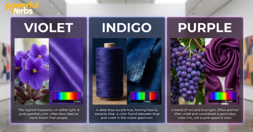
Violet consistently reads as blue-leaning. If you look at a color and your instinct is that it belongs closer to blue than to red, you are most likely looking at violet. It has a cool, almost electric quality in its purest form. Flowers like lavender and certain orchids display this quality naturally, and it is why many people describe them as bluish-purple even when they are technically closer to spectral violet.
Indigo reads as a very deep, dark blue with a subtle warmth beneath the surface. It does not look purple in the conventional sense. It looks more like a navy blue that has absorbed a trace amount of violet. The color of classic blue denim is often described as indigo, and when you hold a pair of unwashed jeans up to natural light, you can sometimes see that ghostly violet undertone that separates it from a flat navy. Indigo feels heavy and deep rather than bright or vivid.
Purple reads as a blend, and its warmth or coolness depends entirely on how much red has been mixed into it. A purple that leans heavily toward red looks warm, almost passionate or aggressive. A purple that leans toward blue looks cooler and more refined. This flexibility is part of why purple appears so frequently in branding and design. It can be adjusted to carry very different emotional tones while remaining recognizably purple.
Lighting dramatically affects how all three colors appear. Warm incandescent light pushes violet toward purple and makes indigo look almost brownish or muddy. Cool daylight or blue-tinted LED lighting pushes purple toward violet and makes indigo appear crisper and more distinct. If you are trying to identify which of these colors you are actually looking at, always check it in neutral natural daylight first.
How Indigo Found Its Place in the Rainbow — and Why Some Scientists Want to Remove It
The story of indigo in the rainbow is one of the more fascinating intersections of science and culture in the history of color. When Newton conducted his famous prism experiments in the 1660s, he identified five primary colors in the spectrum. He later expanded this to seven, adding orange and indigo, because seven was considered a number of special significance in philosophy, music theory, and astronomy. The decision was as much symbolic as it was empirical.
Modern color vision research has generally confirmed that most people cannot reliably distinguish indigo from the neighboring blues and violets without significant training or controlled conditions. The area of the spectrum that Newton labeled indigo registers to the average human eye simply as a dark or deep blue. Some vision scientists have proposed removing indigo from the official rainbow model entirely and describing the visible spectrum with six primary bands instead of seven. Others argue that the traditional seven-color model should be preserved for cultural and educational consistency.
What this debate reveals is something important about color itself. The categories human beings use to organize color are not objective facts built into the universe. They are frameworks that cultures and scientists have constructed to make sense of a continuous spectrum that has no natural dividing lines. Violet, indigo, and purple are labels that carry history, not just physics.
The Rich Cultural History Behind Each Color
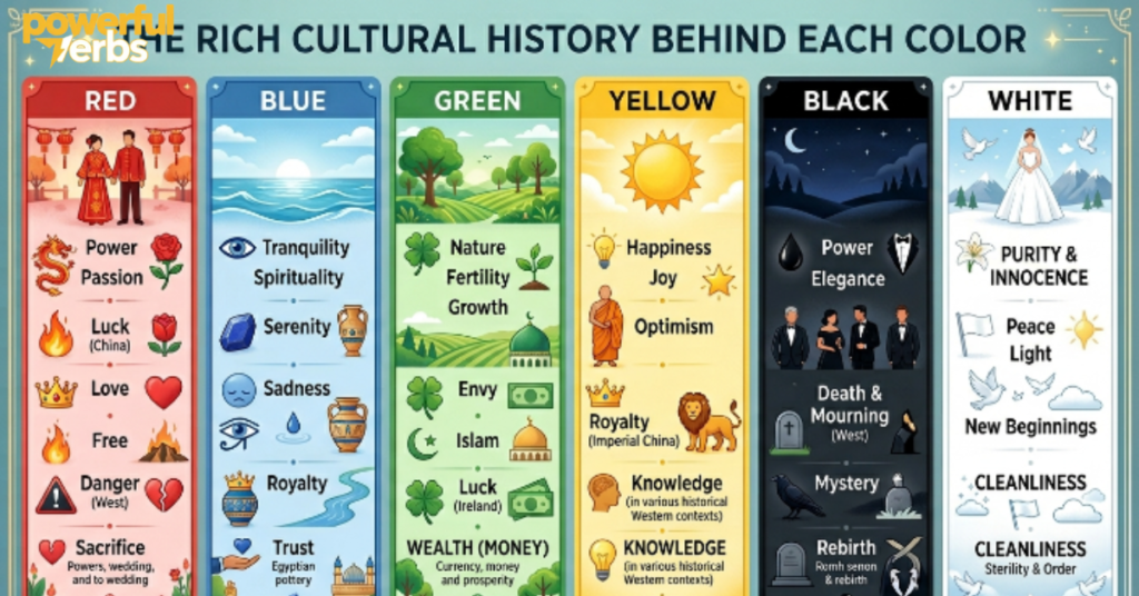
Understanding where these colors come from culturally makes their visual differences feel even more meaningful. Each color has accumulated centuries of association, symbolism, and economic significance.
Violet carried deep spiritual meaning across multiple ancient civilizations. In early Christian art and iconography, violet or purple robes appeared on figures of religious authority and divine power. Medieval European churches used violet-tinted stained glass to create an atmosphere of mysticism and transcendence. In Hindu philosophy, the seventh chakra — Sahasrara, associated with higher consciousness and spiritual enlightenment — is represented by violet. The color became synonymous with the boundary between the material world and something beyond it, which explains why violet imagery appears so consistently in art focused on meditation, prayer, and contemplation.
Indigo has one of the most economically and politically significant histories of any color in human civilization. The indigo plant, particularly Indigofera tinctoria, has been cultivated for dye production in India for at least four thousand years. Ancient texts from India describe indigo trade routes reaching the Mediterranean world long before European colonization. When European colonial powers arrived in Asia and the Americas, indigo cultivation became a cornerstone of colonial economies, often built on enslaved and exploited labor. The trade in indigo dye influenced the establishment of plantation systems across South Asia, West Africa, and the Caribbean. The deep blue-violet color that once stained the fingers of textile workers across three continents is also the color that gave blue jeans their iconic shade in the nineteenth century when denim fabric was dyed with indigo to increase durability.
see also: Vender or Vendor? Here’s the Real Difference
Purple’s cultural history is anchored in one extraordinary fact of ancient commerce. Tyrian purple, the prestige dye of the ancient Mediterranean world, was extracted from the hypobranchial gland of two species of sea snails — Bolinus brandaris and Hexaplex trunculus. Producing a single gram of pure Tyrian purple required the harvesting and processing of thousands of these snails. The dye was extraordinarily labor-intensive to produce and extraordinarily stable once applied, resisting fading through years of wear and washing. This combination of scarcity and durability made Tyrian purple one of the most expensive commodities in the ancient economy. Roman emperors and Byzantine rulers restricted its use to the imperial household. The phrase “born to the purple” entered the language as an expression meaning born into the royal family. When synthetic aniline dyes were developed in the nineteenth century and purple became available to everyone, the color retained its association with prestige and luxury even as it lost its exclusivity.
Symbolism and Psychological Effects of Violet, Indigo, and Purple
Colors communicate before words do. The psychological and emotional associations that human beings carry for these three colors have been shaped by centuries of cultural layering, religious symbolism, and artistic tradition.
Violet is the color most associated with the spiritual and the transcendent in Western and Eastern traditions alike. It represents the meeting point between the warm energy of red and the cool logic of blue, which is why it so often appears in contexts involving wisdom, imagination, and higher understanding. In color psychology, violet stimulates the parts of the brain associated with creativity and introspection. It is often described as the color of people who think deeply and feel things intensely. Design professionals use violet carefully because its spiritual associations can easily tip into a sense of sadness or aloofness if the shade is not chosen precisely.
Indigo carries associations of depth, integrity, and serious intellectual engagement. It does not have the flamboyance of purple or the airy spirituality of violet. Instead, indigo suggests someone who has done the inner work — studied, reflected, and arrived at genuine understanding. Indigo appears frequently in contexts related to intuition, perception, and psychological insight. In the chakra system used in various Eastern spiritual traditions, indigo corresponds to the third eye chakra, Ajna, which governs intuition and foresight. The color is sometimes described as the shade of inner vision — the kind of knowing that comes not from books but from lived experience processed through quiet reflection.
Purple sits at the intersection of passion and thought, which is why it has always been associated with ambition, creativity, and power. The historical connection to royalty and exclusivity still influences how people respond to purple today, even when they are not consciously aware of it. In marketing research, purple consistently performs well in luxury branding contexts and in products aimed at creative professionals. It carries a sense of originality and individuality that red and blue separately cannot achieve. In color therapy traditions, purple is believed to stimulate imagination and encourage unconventional thinking.
Mixing Violet, Indigo, and Purple in Art and Design
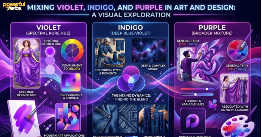
For artists and designers, the practical challenge is not just understanding these colors philosophically but being able to create them reliably in different media. Each color presents its own mixing challenges.
Violet is the hardest of the three to mix convincingly in traditional pigment media. The difficulty is that violet in paint is not the same as violet as a wavelength of light. Most blue pigments contain traces of other hues that push the mix toward muddy gray or muted lavender when red is added. The most reliable way to achieve a clean violet in paint is to start with a pure, transparent blue such as phthalo blue or ultramarine and add only a very small amount of a clear, bright red such as quinacridone red or alizarin crimson. Too much red immediately pushes the mixture into purple territory. The proportions matter enormously, and the difference between a successful violet and an accidental purple can be a fraction of a brushstroke.
Indigo in paint has the interesting quality of being easier to recognize than to reproduce. Many artists achieve indigo-like results by taking a deep phthalo blue and adding a very small amount of purple or black. Others use Prussian blue as a starting point because its inherent depth and slight green undertone can be pushed toward indigo with the addition of violet. True indigo pigment is available in specialist art supply stores, but it is rarely used in contemporary painting because the synthetic alternatives are more stable and easier to work with. In digital design, indigo sits in RGB space at approximately R75, G0, B130, though slight adjustments in either direction quickly push the color toward blue or violet.
Purple in paint offers the most flexibility because its warm-cool range is so wide. Equal parts red and blue produce a neutral mid-tone purple, but shifting the ratio in either direction changes the character of the color significantly. Adding more red creates a warm, assertive purple with energy and movement. Adding more blue creates a cooler, more meditative purple that sits quietly in a composition. In digital design and web development, purple is one of the easiest colors to adjust because the RGB or HSL sliders respond predictably. Increasing the blue channel cools it toward violet. Increasing the red channel warms it toward magenta. Adjusting the saturation moves it between rich and muted without changing its fundamental identity.
Violet, Indigo, and Purple in the Natural World
Nature’s relationship with these colors is fascinatingly uneven. Some are abundant in the natural world while others require very specific and unusual chemistry to appear.
Violet appears with relative frequency in the plant kingdom because the chemical compounds responsible for it, primarily a group of plant pigments called anthocyanins, are common in flowers and some fruits. Anthocyanins are interesting because their actual color depends on the pH level of the plant tissue surrounding them. In acidic conditions they appear red. In neutral conditions they appear purple or violet. In alkaline conditions they shift toward blue. This is why some flowers appear to change color slightly as they age or as soil chemistry changes. The petals of lavender, certain species of iris, and violet flowers themselves all contain these compounds in proportions that produce the blue-leaning spectral violet that scientists recognize.
Indigo in nature is closely linked to the chemistry of the indigo plant family, particularly the leaves of Indigofera tinctoria. The compound responsible for the dye, indigotin, develops through a fermentation process that converts colorless plant compounds into the deep blue-violet pigment. This process was understood empirically by dye workers for thousands of years before chemists isolated and identified the specific molecular reactions involved. True natural indigo does not appear abundantly in animals or flowers the way violet does. Its presence in nature is primarily botanical and linked to specific plant families that developed the chemistry as part of their biological processes.
Purple is genuinely rare in the natural world, which is part of why it has always carried connotations of rarity and prestige. The optical challenge of producing purple in a biological organism is significant because purple requires the simultaneous stimulation of both red-sensitive and blue-sensitive receptors without triggering the green-sensitive ones. Most natural pigments produce color by absorbing specific wavelengths, and producing the right combination for purple requires unusual molecular structures. Grapes, plums, eggplants, and certain tropical bird feathers achieve purple through combinations of pigments or through structural coloration — microscopic surface structures that reflect light in specific ways rather than relying on chemical pigments alone.
Practical Guide to Identifying These Colors in Everyday Life
All the theory in the world becomes more useful when it translates into practical visual judgment. Here is a reliable approach to identifying which color you are actually looking at.
Start by asking whether the color looks warm or cool. Violet is almost always cool, leaning toward blue. If you see red or warmth in it, it is probably purple. Indigo is also cool but feels darker and heavier than violet, closer to a navy blue than to anything bright or airy. Purple can go either direction depending on its composition.
Next, consider the depth of the color. Indigo is almost always very deep and dark. Violet can range from pale to vivid but rarely appears as dark as indigo at its truest. Purple covers the full range from extremely pale lavender to very dark plum, which is part of what makes it the most versatile of the three.
Finally, consider what the color is sitting next to. Color perception is never absolute — it is always relative to surroundings. A violet that sits next to a warm red will look cooler and more blue than the same violet sitting next to a cold navy. Indigo that sits beside a bright purple can look almost gray. Checking a color against a neutral gray background gives you the most reliable read on its actual identity.
How These Colors Function in Modern Design and Branding
Contemporary designers work with these colors strategically, drawing on both their visual qualities and their cultural associations to create specific emotional responses in audiences.
Violet in digital interfaces and branding suggests innovation, spiritual depth, and a willingness to challenge convention. Technology companies sometimes use violet to signal that they occupy the boundary between rational left-brain thinking and creative right-brain exploration. It works particularly well in wellness products, meditation apps, and platforms aimed at creative professionals who want to be seen as thoughtful and original rather than flashy.
Indigo has become increasingly popular in branding contexts that want to communicate stability and trustworthiness without the corporate coldness of standard navy blue. It carries enough of violet’s creativity to feel fresh while remaining grounded enough to feel dependable. Denim brands, craft beverage companies, and certain financial services firms have all explored indigo as an alternative to conventional corporate blue that still reads as serious and substantial.
Purple remains the go-to choice for luxury brands, creative industries, and any product aiming to project prestige and distinctiveness. Its historical associations with royalty and exclusivity make it immediately legible as a premium signal in most markets. However, designers working with purple need to be careful about which specific purple they choose. A warm, red-leaning purple feels passionate and indulgent. A cool, blue-leaning purple feels more refined and intellectual. The wrong choice for the wrong brand context can send a very different message than intended.
FAQs
Are violet and purple actually the same color?
They are not the same color. Violet is a real spectral color that exists as a specific wavelength of light, while purple is a perceptual color that the human brain creates when red and blue light signals arrive simultaneously without a corresponding green signal.
Why did Newton include indigo in the rainbow if scientists now question it?
Newton added indigo to make the rainbow contain seven colors, which aligned with symbolic associations between the number seven and musical notes, classical planets, and philosophical systems of his era. Modern color science views the spectrum as a continuum where indigo is difficult to distinguish from neighboring blues and violets.
Can the human eye actually see the difference between violet and purple?
Yes, though it requires practice and the right conditions. Violet leans strongly toward blue and has a spectral purity that pure purple lacks. Under controlled natural lighting, a trained eye can reliably separate the two, though in everyday conditions they are easy to confuse.
Why is purple associated with royalty and wealth?
The ancient Tyrian purple dye required thousands of sea snails to produce even small quantities, making it extraordinarily expensive. Only emperors, kings, and the wealthiest members of society could afford garments dyed with it, which permanently linked the color to power and prestige in Western cultural memory.
How do artists mix a clean violet without it turning into purple?
The key is using a cool, transparent blue such as ultramarine or phthalo blue and adding only a very small amount of a pure, bright red such as quinacridone or alizarin crimson. Adding too much red immediately shifts the mixture into purple. The ratio requires patience and small, controlled additions.
Is indigo still relevant as a color category today?
Indigo remains culturally and commercially relevant even if its scientific status as a separate spectral band is debated. The indigo dye tradition continues in artisan textile communities worldwide, and the color plays an important role in interior design, fashion, and branding contexts where a deep, complex blue-violet is needed.
Conclusion
Violet, indigo, and purple are three colors that look similar on the surface but carry entirely different stories underneath. Violet is a genuine wavelength of light that nature produces without any human assistance. Indigo is a historically powerful dye color whose place in the scientific rainbow has been debated for centuries. Purple is a masterpiece of human perception — a color the brain builds from scratch because physics alone cannot produce it.
Understanding these differences does not just satisfy curiosity. It sharpens the way you see color in art, in nature, in design, and in the world around you. The next time someone describes a flower as purple when it is clearly violet, or calls indigo just another shade of blue, you will know exactly why the distinction matters and exactly what it means.

Liam Johnson is a dedicated language expert with 4 years of professional experience. He specializes in Grammar, Vocabulary, and Sentence structure.
